 Searching...
The power of colour and how it affects our mood
)
Colour is powerful. It can transform a room, create an atmosphere, and even influence how we feel. From darks to lights and neutrals to brights—the following post covers ten different hues and how they affect our mood.
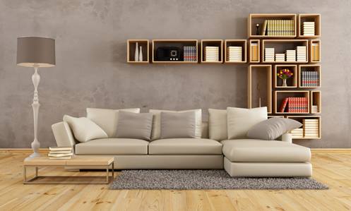
1. Grey
Greys have a mellowing effect. Similar to blues, greys inspire tranquility. This versatile colour is on-trend this season and is great in any room of the house (especially spaces where you want to relax).
2. Cream
Cream and other neutral shades are commonly found in nature, and therefore convey peacefulness. These effortless hues are also popular this year and easily complement most other colours. Freshen up your bedroom, living room, or kitchen with warm tones of this classic favourite.
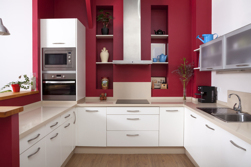
3. Red
In contrast to the colours mentioned above, red is lively and exciting. It is the colour of passion and is best used to encourage stimulation. Red can be a great colour in a kitchen, dining room, or any space—provided it’s the right shade.
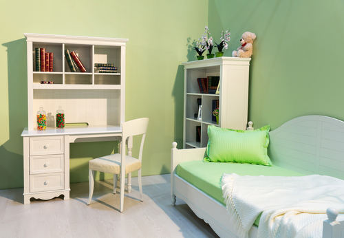
4. Green
Green is the colour of harmony and hope. This colour connects you to the natural world and therefore has an uplifting effect on your mood. Green is perfect for rooms you spend time working/thinking in, such as a study, office or bedroom.
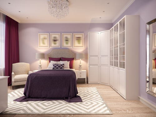
5. Purple
For centuries, purple has been the colour of royalty. It is regal, prestigious, and ever-so decadent. Purple makes a space feel comfortable and safe, and we find it’s especially well suited to bedrooms.
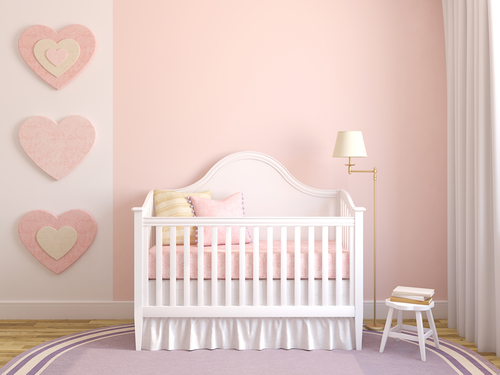
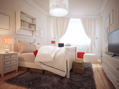
6. Pink
Pink is playful and friendly, welcoming the eye with its sugary sweetness. It calls to mind flowers and springtime and is right at home on the walls of a nursery or bathroom.
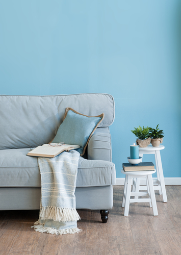
7. Blue
Like a babbling brook and the soft ocean waves, blue is the quintessential calming colour. Retire to your blue room when you want total serenity. This colour works beautifully in bedrooms, bathrooms, living rooms, or any space you want to add instant chill.
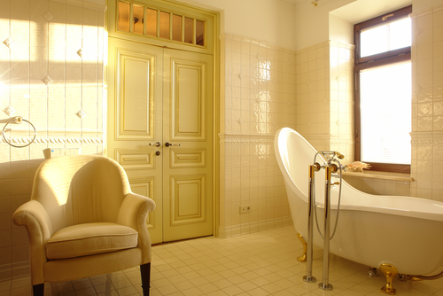
8. Yellow
Yellow is the colour of sunshine and happiness. It brightens a space while also brightening your mood. It's probably near impossible to be sad in a yellow room. This colour is lovely in kitchens, playrooms or bathrooms, but can be incorporated wherever you desire a dose of vitamin D!
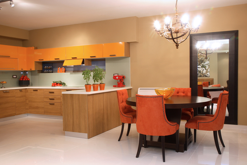
9. Orange
Similar to red, orange is vibrant and powerful. This distinctive shade, when used incorrectly, has the potential to assault the eyes, so it’s best alongside a neutral tone.
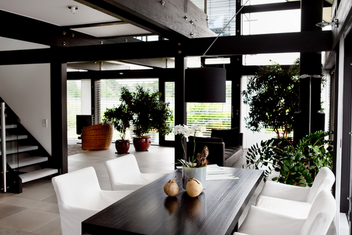
10. Black
Black is the colour of mystery. It conveys elegance and sensuality, and can look incredibly chic within the home. Partner black with another colour for a striking, sharp design.
Congrats! You're well on your way to harnessing the magic of colour. We hope the above serves as a helpful reference for those looking to use paint more thoughtfully throughout their homes. For more colour and design advice, call into your local crown paints stockist or visit us on the web. Happy painting!