 Searching...
How to use bold textiles to enhance your space
)
Textiles provide an instant and inexpensive way to add some liveliness to any space. Curtains, rugs, pillows, and throws allow you to play with colour and pattern without too much commitment. The following post covers some of our favourite bold patterns and provides suggestions on how you can pair them beautifully with different wall colours.
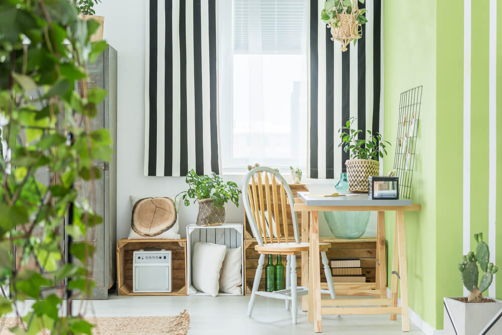
Seeing Stripes: In our opinion, you can never go wrong with a classic stripe. This season, go bold with thick stripes in colours that pop. Opt for a stripe pattern that complements your space—this usually means choosing stripes where at least one of the colours is within the same family as your walls. Try striped curtains for a well-dressed focal point!
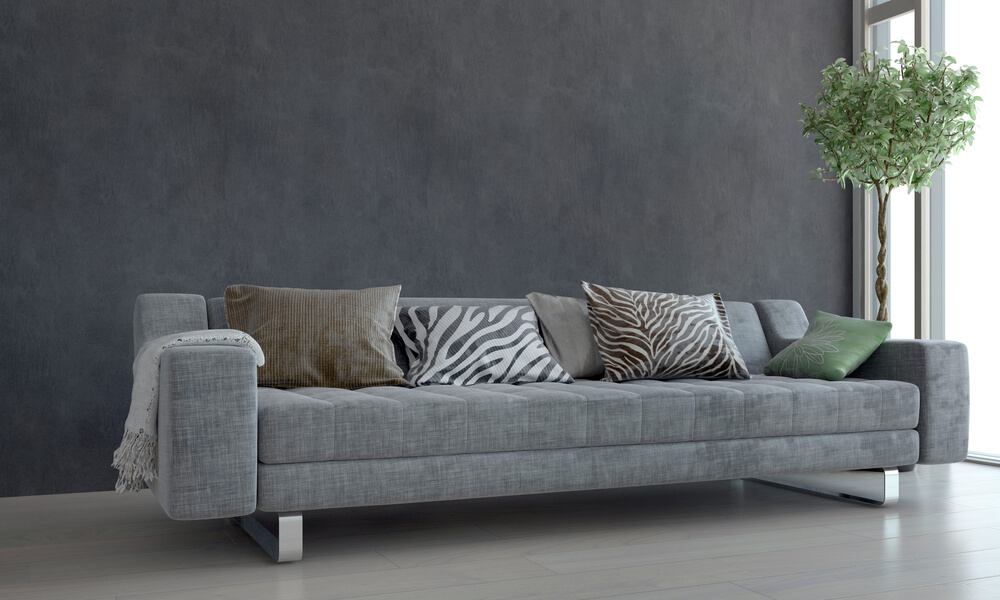
Animal Instincts: Take a walk on the wild side and use animal-printed textiles to give your space an on-trend boost of grrrrrrreatness. Animal patterns such as leopard, zebra and tiger look especially fabulous when paired with neutral walls, like creams, or greys. Try them on rugs or pillows for a rustic, just-back-from-safari feel.
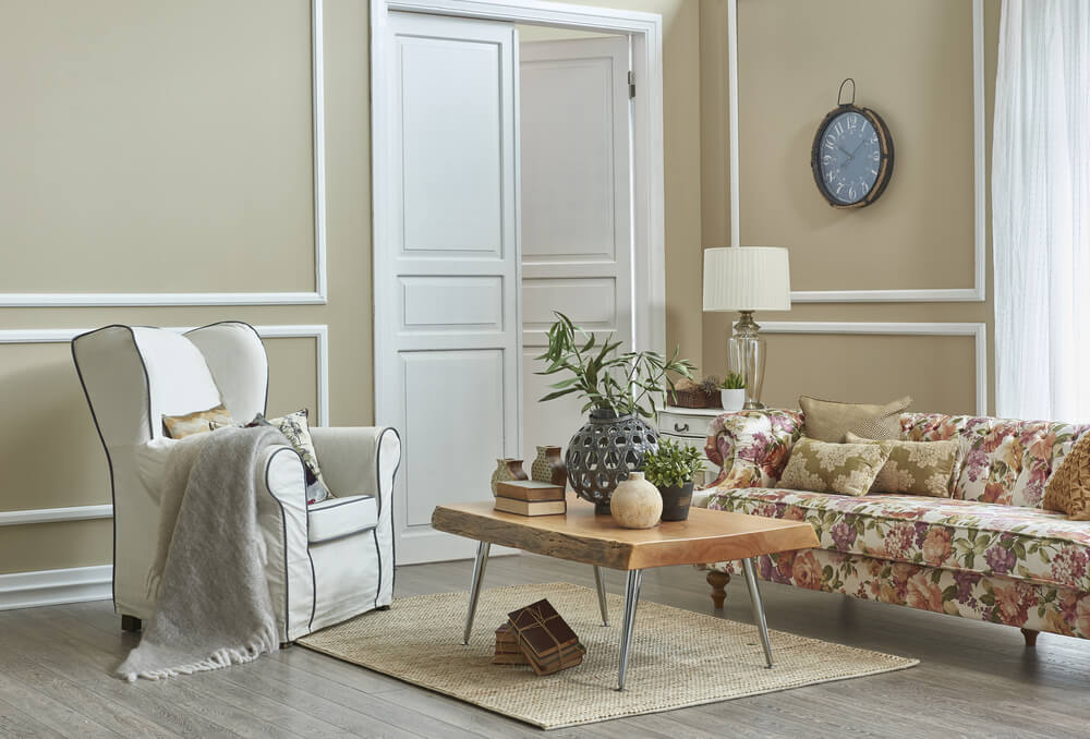
Flower power: The category of “florals” covers a wide array of pretty patterns, from ditsy prints to botanicals (and everything in between). Florals are the perfect way to introduce a tapestry of colour to any room, and they’re oh-so-pretty to look at! Who doesn’t enjoy feeling like they’re sitting in a blossoming meadow? We encourage you to gold bold with your floral textiles this year, using eye-catching prints in curtains, pillows and furniture. Choose a floral print that includes your wall colour to really bring out the best in both.
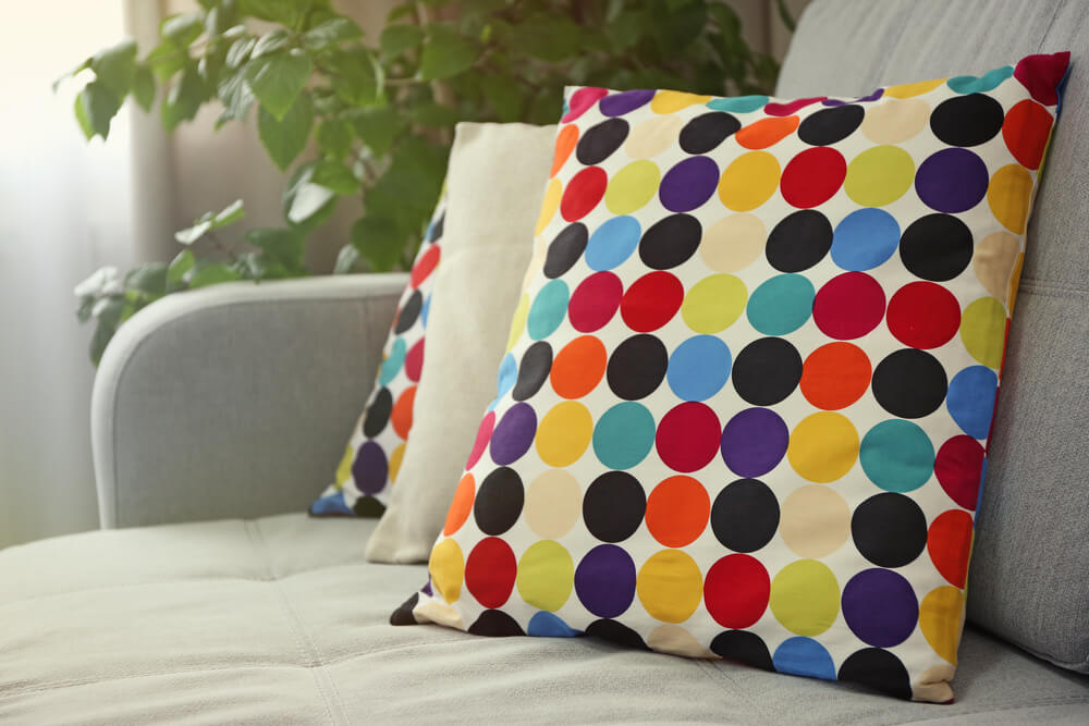
Darling Dots: From clothing and accessories to homegoods and décor, polka dots are a hit this season! Thankfully, this pattern looks just as good in your textiles as it does on your dresses. Go bold with this print by choosing larger dots, and/or colours that pop. Try a black and white pattern for a monochromatic wow or add a dash of fun with multicoloured confetti dots. Dots can go with any room colour, and we especially love dots alongside bright, playful colours like pink and green.
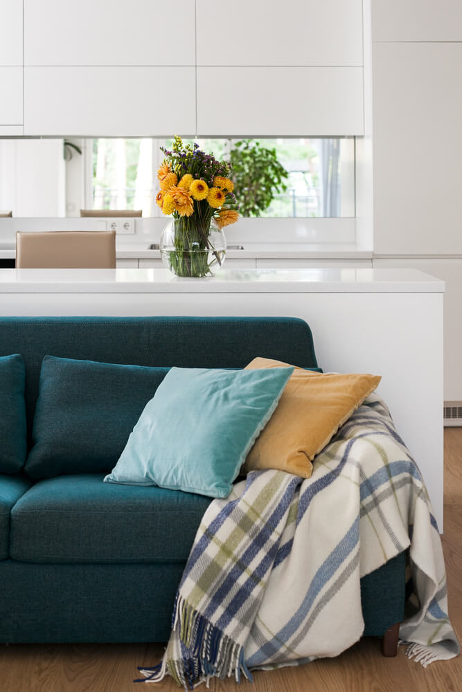
Check Mate: Amplify your room with a pattern that will never go out of style. To take the ordinary to extraordinary, choose checks that have unique, even contrasting colour combinations. Check-printed textiles are a great option for white rooms where you want to keep things minimalistic—with a playful twist!
Textiles give you a simple way to maximise your style, and the above patterns are always on our radar. Use textiles to complement your wall colours and enhance your space. For even more expert design advice, call into your local Crown Paints stockist or visit us on the web.