 Searching...
Five creative colour palettes to try this year
)
By now we’re getting into the swing of 2020. Is it just us or do the holidays seem like they were years ago? We’ve been working on our 2020 design resolutions, and one of them is to play with colour. This year, we’re trying to step a little out of our comfort zones and experiment with colours and styles that we may have been too intimidated to try in the past. No regrets! Sure, what’s the worst that can happen? Below are some creative colour palettes we’re loving this year.
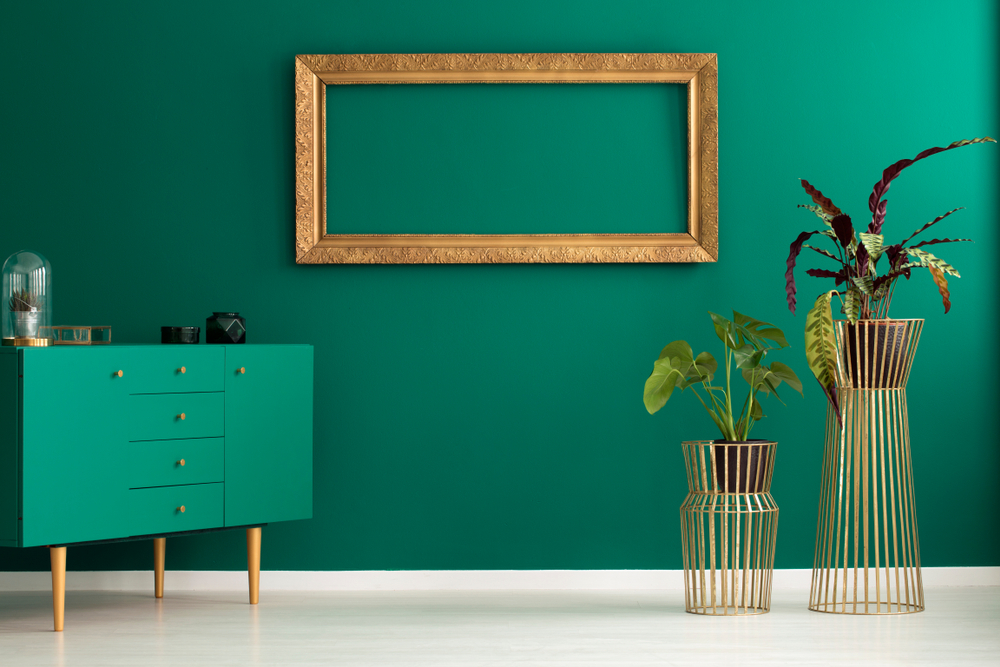
Teal and Tan: We love botanicals at the moment, and using a poppy teal is a perfect way to enjoy some green within the home. Teal and tan combined work well together and remind us of clear ocean waters and soft warm sand—the perfect day at the beach! While this January weather has been anything but tropical, we can still bring a bit of the holiday spirit to our homes with this soothing colour palette. Try our shades Teal and Soft Cream to get the look.
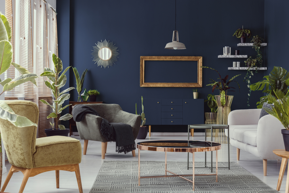
Navy, white and gold: Talk about regal! A deep navy coupled with a gorgeous gold will make any room fit for a queen! We love the way navy looks with bright white trim and shiny gold accents. To increase the wow factor, stencil a gold pattern on a navy backdrop—you’ll feel like royalty in no time!
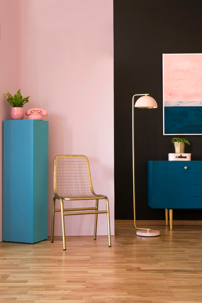
Pink and blue: This classic colour combination looks stunning together, whether you go for deep or lighter tones. A navy blue with a hot pink is not for the shy, but if you’re ready to take the plunge, you can be sure that this eye-catching palette will capture your heart! We also love light pink and baby blue in nurseries or children’s rooms for a sweet and gentle vibe. Try our shade Ballet Shoes with Moonlight Bay to get the look!
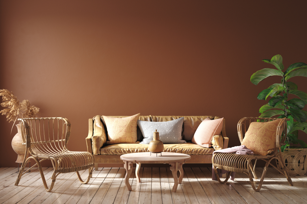
Terracotta and green: We’re loving earthy tones for the year ahead and you can’t get more natural than a rich brown and a vibrant green together. These two colours complement each other in the best way possible—which only makes sense, because they’re paired by Mother Nature herself! Try this look in your living room, paired with natural wooden accents (another trend we’re embracing) for a stylish oasis you’ll love well into the new decade. Try our shades Arts and Crafts 7 (available via our colourmix service) and Box Tree to set the scene.
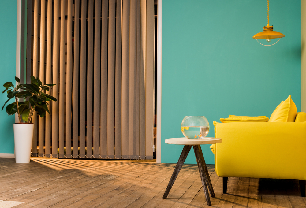
Yellow and Turquoise: Talk about bright and happy! It’s hard not to smile when you’re looking at a buoyant yellow (or a darker gold) paired with a bright turquoise. These two colours combined call to mind sunny Spanish streets and a cloudless summer sky. Turn your space into a holiday with our colours Aqua Fizz (available via our Colourmix service) and Happy Daze. Add a dash of red within your yellow and turquoise room for a striking look.
Will you be trying any of these colour combinations this year? We’d love to see your creations! For everything you need to get started on your paint journey, call into your local Crown Paints stockist. You can always visit us on the web for more inspiration.