New year, new colours to try in your home
Happy New Year! The beginning of 2021 brings the perfect opportunity to evaluate your home and reinvigorate it for the twelve months ahead. Are your walls in need of some TLC? We think January is the ideal time to consider painting your interiors, and we have some fabulous colours for your consideration.
While we believe all the colours in our MoodBoards collection are timeless, this year we are especially loving nature-inspired tones and cheerful, uplifting shades. Why not inject your house with some of the same optimism we’re feeling for the future?
Our MoodBoards collection was developed in association with House and Home, and below you’ll find a selection of our colour recommendations for the coming year.
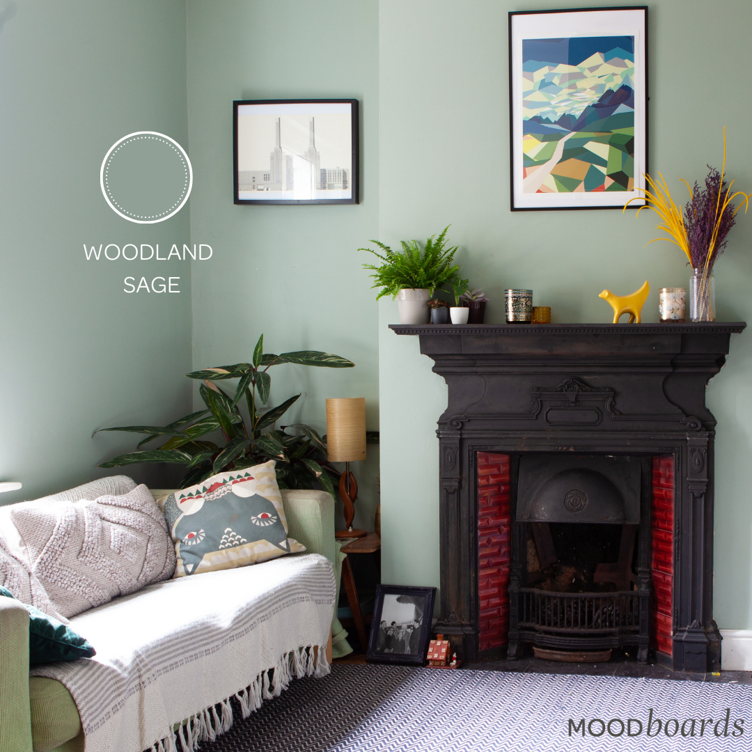
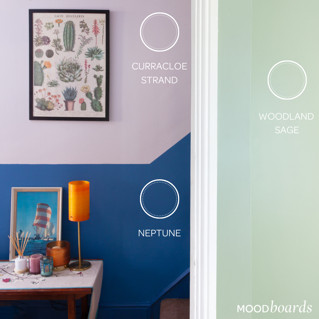
Woodland Sage: if you’re searching for the perfect fresh green, look no further than our shade Woodland Sage. Soft and airy with touches of grey, this shade is certainly one of our favourites. As the name would suggest, Woodland Sage is reminiscent of a peaceful walk in the forest. This complementary colour will suit any interior style and looks excellent when paired with other natural tones, purples, pinks, yellows and reds!
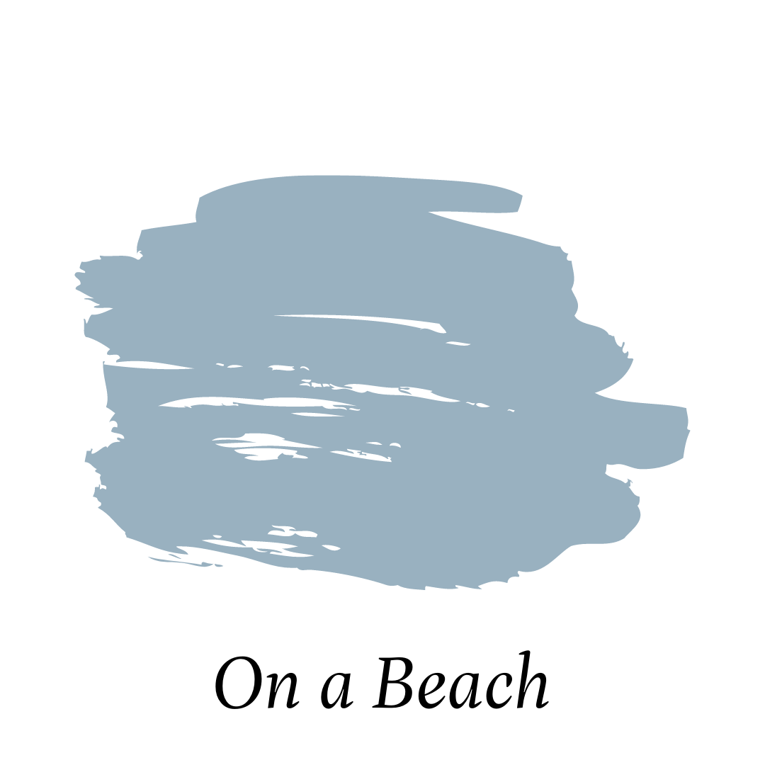
On a beach: Take a retreat to the seaside with our shade On a Beach. An enchanting mid-tone blue, this refreshing colour will bring the tranquility found after a sunrise swim into your home. On a Beach is particularly suited to bedrooms, living rooms, or any other space where relaxation is key. Pair with bright whites for a crisp and classic nautical look.
Neptune: If you want a blue that’s daring, deep, and decadent, our shade Neptune is for you! This blue makes a statement without overwhelming your interiors. A colour that is both classic and contemporary, Neptune will instantly rejuvenate any room. Try this shade in your bathroom and pair with brass fixtures and bold tiles to create a gorgeous oasis.
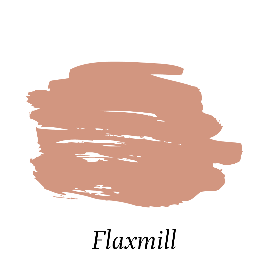
Flaxmill: Not too red and not too pink with hints of warm brown, Flaxmill is reminiscent of a terra cotta (but with a twist!). This sumptuous shade is for those looking for a colourful neutral, who might otherwise shy away from red tones. Flaxmill would look exceptional anywhere in the home, and we’re loving it for kitchens, dining rooms, and living rooms.
Artwork by Rachael Varah
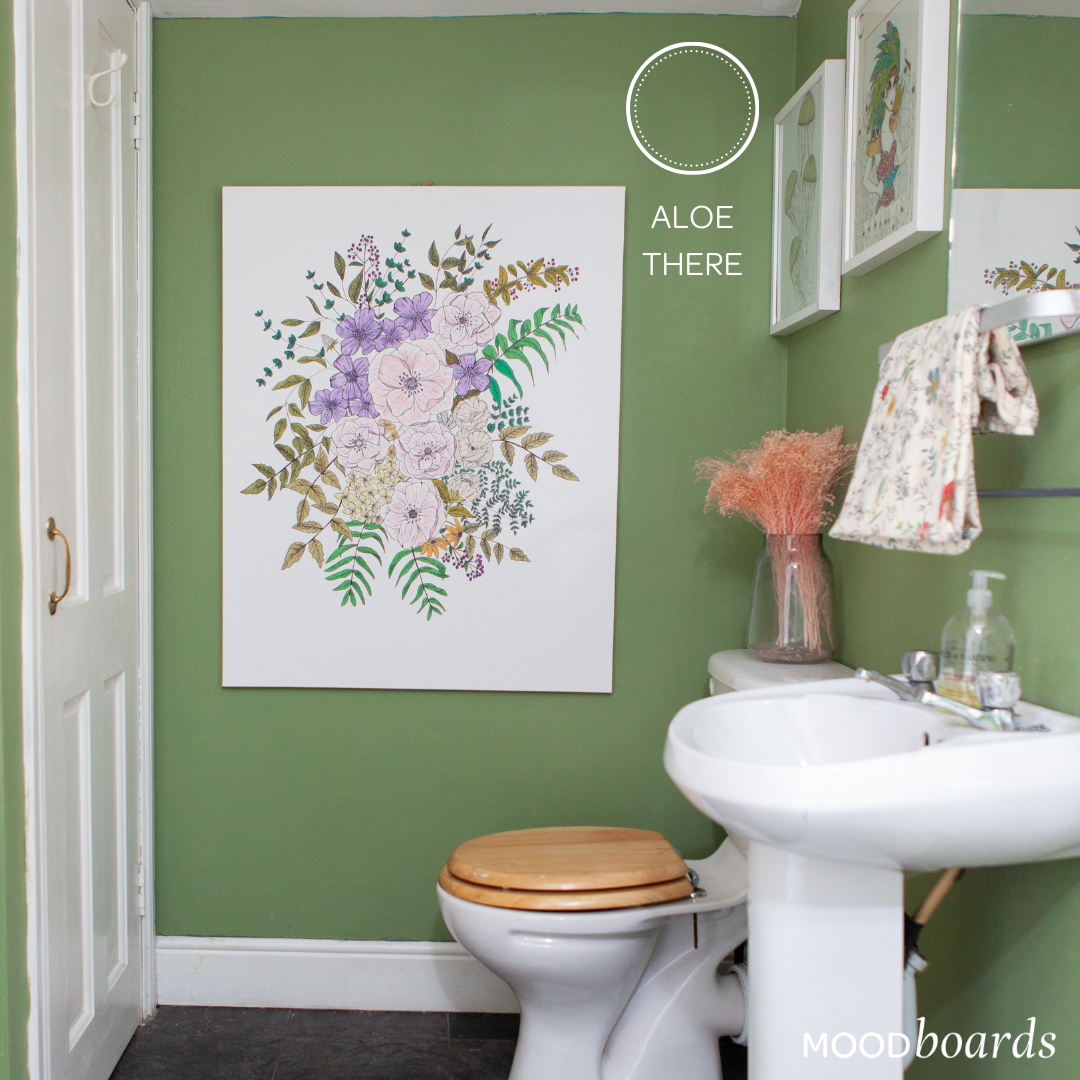
Aloe There: Picture a lush woodland after a rainfall, when the gorgeous natural colours around you seem more vibrant than usual and the greenery even more energised. Enter the shade Aloe There, a vivid green that will relax the mind and bring a natural serenity to your space.
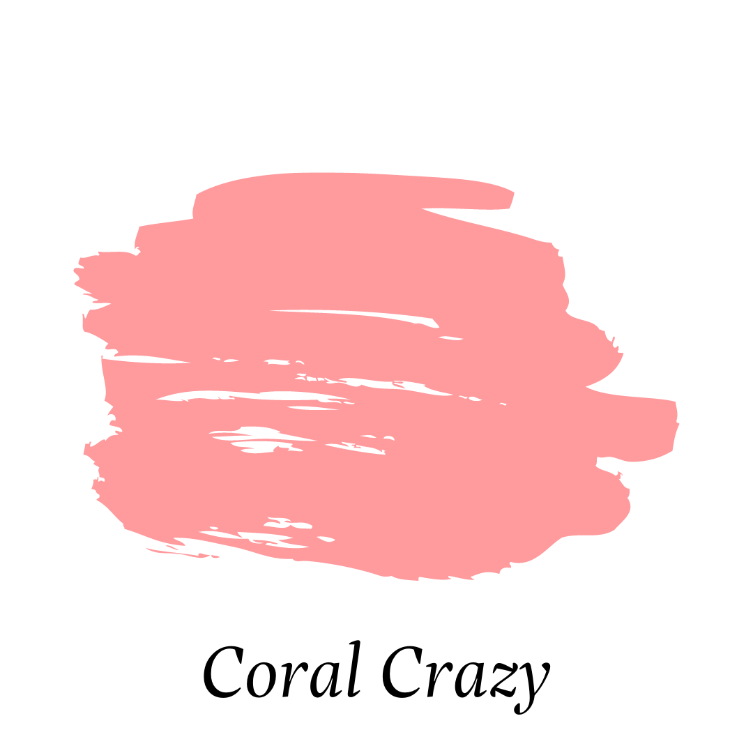
Coral Crazy: For those who like a powerful colour and aren’t afraid to get funky, meet your new best friend. Coral Craze is a bright (almost neon) mid orange-pink that is guaranteed to knock your socks off (in the best way possible). If you’re looking for a happy and sunny shade that packs a punch, Coral Crazy is it! Why not have some fun in 2021?!
Our MoodBoards collection offers 108 special shades so that you can create your own unique MoodBoard within your home to fit your special style. Each and every colour was developed with care and consideration. To order your MoodBoards colour card and to find out more, visit https://moodboards.crownpaints.ie/.
 Searching...
)
